


What is the Bitcoin Rainbow Chart and How to Use It?
%201.svg)
%201.svg)

Are you ready to unlock the secrets of Bitcoin's price movements? Look no further than the Bitcoin Rainbow Chart! This colorful chart is a powerful tool for traders and investors looking to better understand the market.
In this article, we're going to cover the ins and outs of the bitcoin rainbow chart. Let's start by understanding what it is, how it works and how you can use it to make more informed investment decisions.
What is the Bitcoin Rainbow Chart?
The Bitcoin Rainbow Chart is a technical analysis tool that visualizes Bitcoin's historical price movements. It's called a "rainbow" chart because it uses different colors to represent different price ranges. The chart consists of seven colored bands, each representing a different percentage increase in Bitcoin's price.
The seven bands on the chart are:
- Dark Red: 0% to 20% increase
- Red: 20% to 50% increase
- Orange: 50% to 100% increase
- Yellow: 100% to 200% increase
- Green: 200% to 400% increase
- Blue: 400% to 800% increase
- Purple: 800% and above increase
Each band has a corresponding range of Bitcoin prices that falls within that band. For example, the Dark Red band represents a price range of $0 to $9.8, while the Purple band represents a price range of $19,762 to infinity.
History of the Bitcoin Rainbow Chart
The Bitcoin Rainbow Chart has an interesting history that dates back to the early days of Bitcoin. The first version of the chart was created by a Reddit user named Azop as a fun way to depict Bitcoin's price history.
However, it wasn't until a trader known as "Trolololo" on the BitcoinTalk forum developed the second version of the chart that it gained widespread recognition as a technical analysis tool. Trolololo paired the rainbow chart with logarithmic regression, creating a more sophisticated version of the chart that has become a valuable tool for traders and investors alike.
Over time, the chart evolved to include seven different colored bands, each representing a different percentage increase in Bitcoin's price. Today, the Bitcoin Rainbow Chart is a widely recognized tool in the cryptocurrency community, used by traders and investors to gain insights into Bitcoin's market movements.
How to Use the BTC Rainbow Chart?
Now that you know what the Bitcoin Rainbow Chart is, let's talk about how to use it. The Rainbow Chart can be used to help traders and investors identify potential buying and selling opportunities. The chart can also be used to help investors gauge the overall health and strength of the Bitcoin market.
Here are some tips on how to use the Rainbow Chart:
Identify the current price band: The first step in using the Rainbow Chart is to identify the current price band that Bitcoin is in. This will help you determine whether Bitcoin is currently overvalued or undervalued.
Look for potential buying opportunities: If Bitcoin is in one of the lower price bands (Dark Red, Red, or Orange), this could be a good opportunity to buy. These lower price bands typically indicate that Bitcoin is undervalued.
Look for potential selling opportunities: If Bitcoin is in one of the higher price bands (Green, Blue, or Purple), this could be a good opportunity to sell. These higher price bands typically indicate that Bitcoin is overvalued.
Consider the trend: The Rainbow Chart can also be used to identify trends in Bitcoin's price movements. If Bitcoin is consistently moving up the chart, this could indicate a bullish trend, while a consistent move down the chart could indicate a bearish trend.
Use other indicators: While the Rainbow Chart can be a helpful tool, it's important to use other indicators and analysis methods in conjunction with it. No single tool or method can provide a complete picture of the market.
It's also important to note that the Rainbow Chart is not a perfect tool. While it can be helpful in identifying potential buying and selling opportunities, it should not be the only tool used to make investment decisions. It's important to do your own research and analysis before making any investment decisions.
Is the BTC Rainbow Chart Accurate?
The BTC Rainbow Chart is a popular tool in the cryptocurrency world, but the question on many traders' minds is whether it's accurate or not.
While it's true that the chart is based on historical data and doesn't take into account future market conditions, it can still be a valuable tool when used in conjunction with other forms of analysis.
Critics of the Rainbow Chart argue that it's too simplistic and doesn't take into account the nuances of the market. While this may be true to some extent, it's important to remember that the chart is just one tool in a trader's toolbox.
Ultimately, the accuracy of the BTC Rainbow Chart depends on how it's used and in what context. Traders who rely solely on the chart may find themselves in trouble, but those who use it as part of a broader trading strategy may find it to be a valuable tool for gaining insights into Bitcoin's market movements.
Also Read - Is Bitcoin Dead? - Complete Analysis for BTC Investors
Limitations of the Bitcoin Rainbow Chart
Here are the main limitations of the Bitcoin Rainbow Chart:
- It is biased towards historical data and may not reflect recent developments or events.
- It has limited predictive power and should not be used as the sole basis for investment decisions.
- The parameters used in the chart are subjective and can lead to different results and conclusions.
- It may not be applicable to other cryptocurrencies.
- It is susceptible to manipulation by market participants.
Are there more Crypto Rainbow Charts?
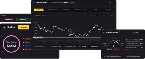
There are indeed more crypto rainbow charts available, as the concept has been adapted and expanded upon by various individuals and organizations in the crypto space. While the original Bitcoin Rainbow Chart remains one of the most well-known examples, other rainbow charts have emerged for different cryptocurrencies, such as Ethereum.
The Ethereum Rainbow Chart and the Bitcoin Rainbow Chart share similarities in that they both use a similar color-coded system to depict the historical price movements of their respective cryptocurrencies.
However, there are also differences between the two charts. The Ethereum Rainbow Chart has a different set of parameters, as the chart is tailored to the unique characteristics of the Ethereum blockchain and its associated token.
Additionally, the Ethereum Rainbow Chart has a different color scheme than the Bitcoin Rainbow Chart, with shades of green representing bullish sentiment and shades of red representing bearish sentiment.
Bottom Line
In conclusion, the BTC Rainbow Chart is a useful tool for traders and investors to better understand Bitcoin's price movements. By using the chart, traders can identify potential buying and selling opportunities.
While its accuracy may be questioned by some, it's important to remember that no single tool can predict the future of the market.
However, it's important to use the chart in conjunction with other analysis methods and to do your own research before making any investment decisions.
Disclaimer
The information provided on this website does not constitute investment advice, financial advice, trading advice, or any other sort of advice and you should not treat any of the website's content as such.
Token Metrics does not recommend that any cryptocurrency should be bought, sold, or held by you. Do conduct your own due diligence and consult your financial advisor before making any investment decisions.
AI Agents in Minutes, Not Months

%201.svg)

.png)


.svg)
No Credit Card Required


Online Payment


SSL Encrypted
.png)
Token Metrics Media LLC is a regular publication of information, analysis, and commentary focused especially on blockchain technology and business, cryptocurrency, blockchain-based tokens, market trends, and trading strategies.
Token Metrics Media LLC does not provide individually tailored investment advice and does not take a subscriber’s or anyone’s personal circumstances into consideration when discussing investments; nor is Token Metrics Advisers LLC registered as an investment adviser or broker-dealer in any jurisdiction.
Information contained herein is not an offer or solicitation to buy, hold, or sell any security. The Token Metrics team has advised and invested in many blockchain companies. A complete list of their advisory roles and current holdings can be viewed here: https://tokenmetrics.com/disclosures.html/
Token Metrics Media LLC relies on information from various sources believed to be reliable, including clients and third parties, but cannot guarantee the accuracy and completeness of that information. Additionally, Token Metrics Media LLC does not provide tax advice, and investors are encouraged to consult with their personal tax advisors.
All investing involves risk, including the possible loss of money you invest, and past performance does not guarantee future performance. Ratings and price predictions are provided for informational and illustrative purposes, and may not reflect actual future performance.